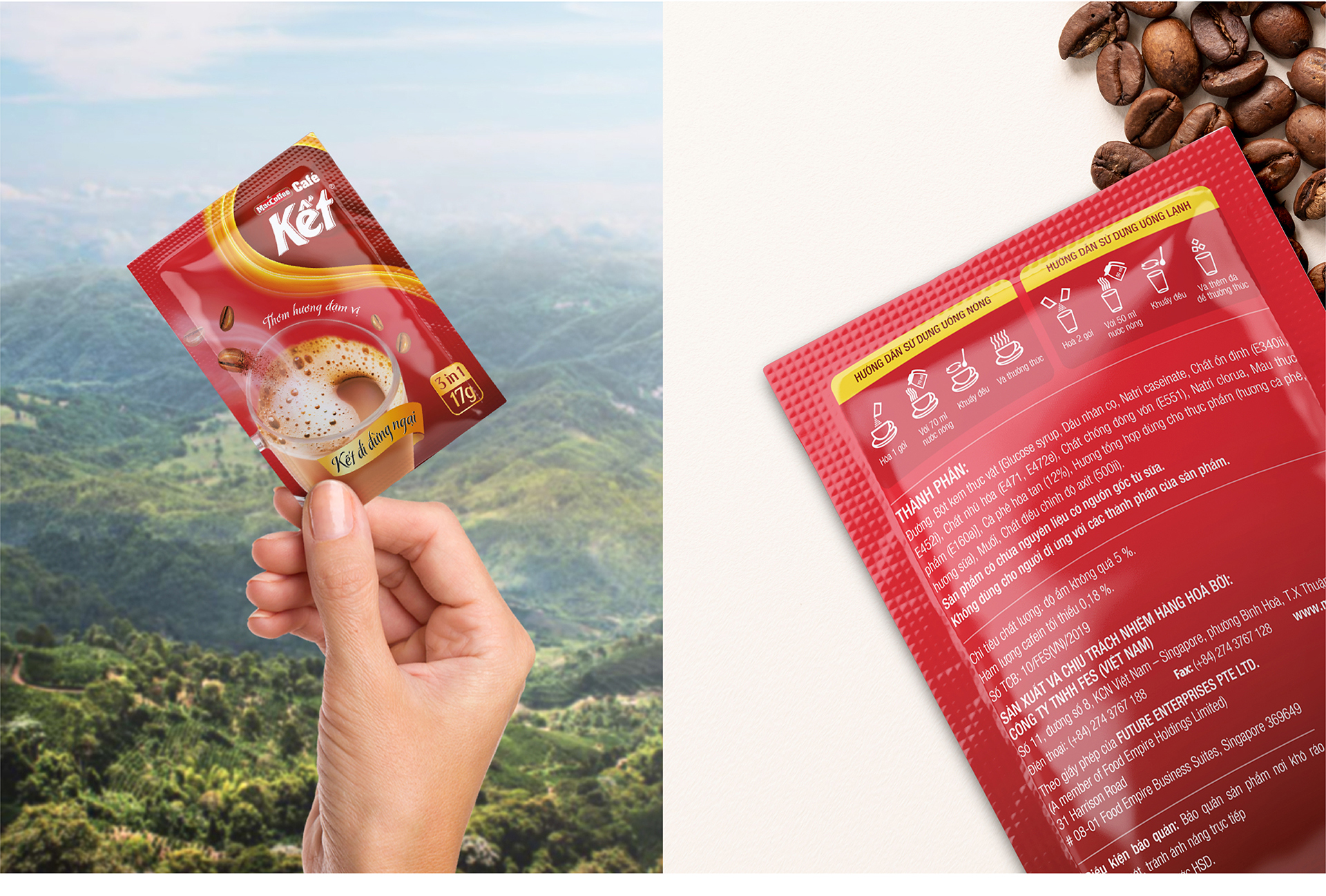
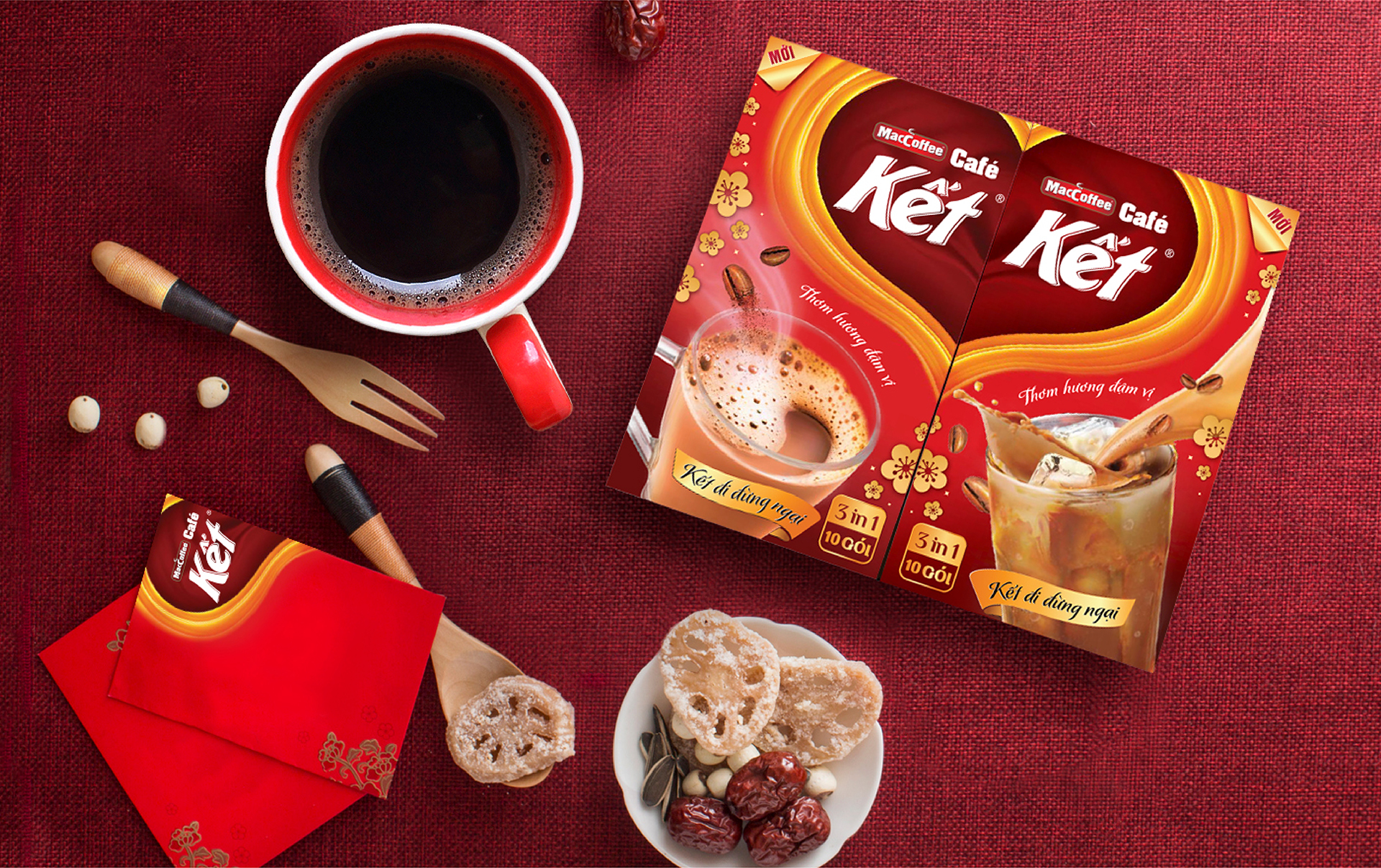
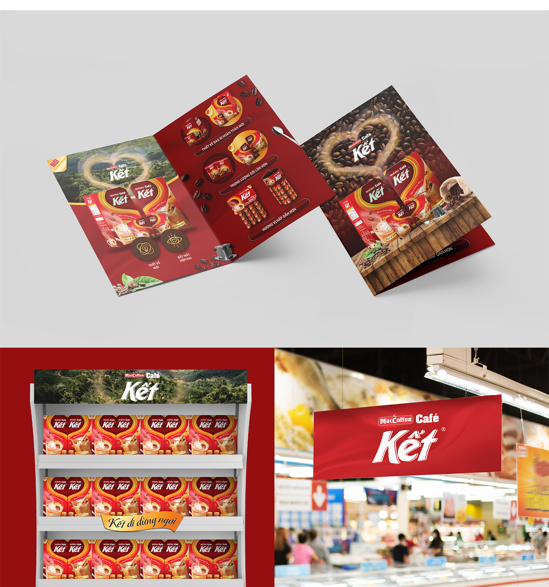
Ket Cafe
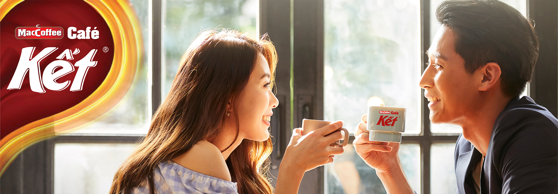
Kết đi
đừng ngại
“Kết” means “like”, is a pairing, a combination, very close and in line with trendy, using words to express the feelings of Vietnamese youth.
From this meaning, Comma designed the symbol of two halves of a heart, when combined, will form a complete heart. Initially, Kết Cafe was created with a target audience of young people, but its packaging was not eye-catching and did not connect with its name. By changing the packaging and using the slogan “Kết đi đừng ngại”, along with the image of a heart and warm colors in the design and key visual that would connect with customers, be memorable, and be close to the story that Kết Cafe wants to tell.